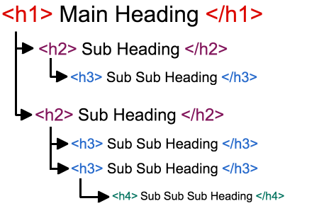
When creating content for your WordPress site, ensuring that your headings follow a logical and hierarchical order is crucial. This practice not only enhances the accessibility of your site but also improves its SEO. In this post, we’ll explore why heading levels should only increase by one and how this impacts both user experience and search engine optimization.
Understanding Heading Hierarchy
Headings are more than just a way to make your text stand out—they define the structure of your content. In HTML, headings are marked with <h1> through <h6> tags, with <h1> being the most important and <h6> the least. The correct use of these tags helps create a clear outline of your content, which is particularly important for both human readers and search engine bots.

Why Proper Heading Levels Matter
- Accessibility for Screen Readers:
Screen readers rely on heading tags to navigate through content. When heading levels are used incorrectly, users with visual impairments may find it difficult to understand the structure of your page. This can lead to a frustrating experience as they attempt to navigate through disorganized content. - SEO Benefits:
Search engines also use headings to understand the context and structure of your page. A well-structured heading hierarchy signals to search engines that your content is organized and relevant, potentially boosting your ranking in search results. - Improved User Experience:
For sighted users, headings act as visual markers that guide them through your content. A logical progression from<h1>to<h2>, and so on, allows readers to quickly scan your page and find the information they need.
Best Practices for Using Heading Levels
- Start with an
<h1>Tag:
The main title of your page should always be marked with an<h1>tag. This is typically used for the page title and should be unique to each page. Avoid using multiple<h1>tags on the same page, as this can confuse both users and search engines. - Follow a Logical Order:
After your<h1>tag, use<h2>tags for main sections of your content,<h3>tags for sub-sections, and so on. Avoid skipping levels (e.g., jumping from an<h1>to an<h3>), as this can disrupt the flow of your content and make it harder to follow. - Use Headings to Structure Content, Not Style:
It’s tempting to use headings to make text bold or larger, but this is a misuse of the tags. Headings should only be used to indicate the structure of your content. For styling purposes, consider using CSS instead.
Example: Structuring a Blog Post
Let’s say you’re writing a blog post about manual camera settings. Your heading structure might look something like this:
<h1>Manual Camera Settings: A Complete Guide</h1>
   <p>Introductory text here...</p>
<h2>Understanding ISO</h2>
   <p>Details about ISO here...</p>
<h3>Adjusting ISO for Different Lighting</h3>
   <p>Information about adjusting ISO...</p>
<h2>Choosing the Right Aperture</h2>
   <p>Details about aperture here...</p>
<h3>How Aperture Affects Depth of Field</h3>
   <p>Details about depth of field...</p>
<h2>Setting the Shutter Speed</h2>
   <p>Details about shutter speed here...</p>
In this example, the <h1> tag introduces the main topic, and <h2> tags are used for the main sections. The <h3> tags introduce sub-topics within each section.
Why Consistency is Key
Consistency in heading levels not only helps users and search engines but also maintains the overall professionalism of your site. A well-structured page is easier to read, easier to navigate, and ultimately more engaging for your audience.
Final Thoughts
Ensuring that heading levels only increase by one is a simple yet powerful way to improve the accessibility, SEO, and overall user experience of your WordPress site. By following best practices for heading hierarchy, you’ll create content that’s not only easier to navigate but also more likely to rank well in search engine results.
Incorporate these practices into your content creation process, and you’ll see the benefits in both user engagement and search engine visibility.

Leave a Reply